photoshop
Before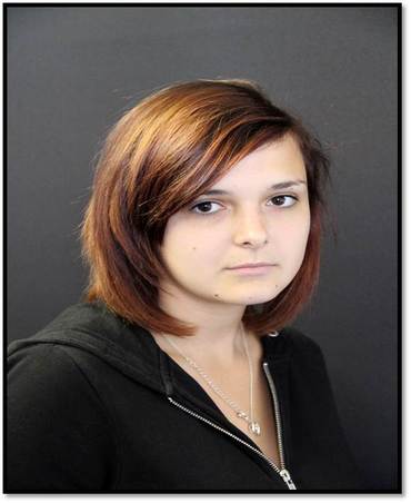
|
After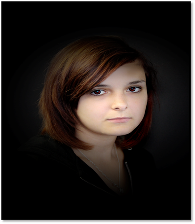
|
Photoshop tools used
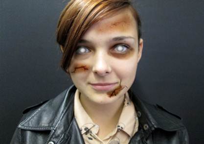
To make the skin pale and flawless we used the clone tool to go over the skin in order to make the skin clear and freckle free we then used the paintbrush tool to change the eye colour from a dark brown shade to a bright red shade in order to make vicky look evil. The final stage was to darken the background to make vicky stand out more in the picture, we did this by using the paintbrush tool again but using a black brush this time.
L.R
L.R
Before
|
After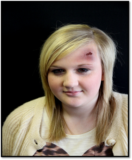
|
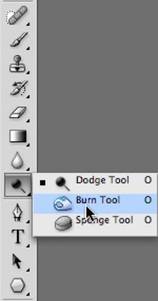
Photoshop tools used to create wound
We first used the burn tool to get the bruised effect underneath the crack. Next we used the crack shaped paintbrush to get the crack shape on top of the bruise to complete the injury on the forehead.We now move on to edit the eyes this is done by first outlineing the eyes with an black paintbrush in order to make them look darker then also using the paintbrush again but in a red colour this time to colour in the eyes to make them look evil. L.R
Before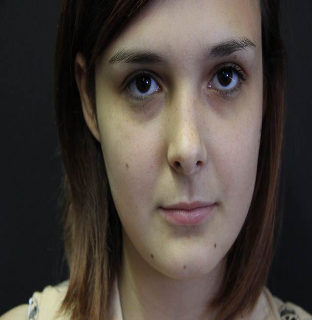
|
After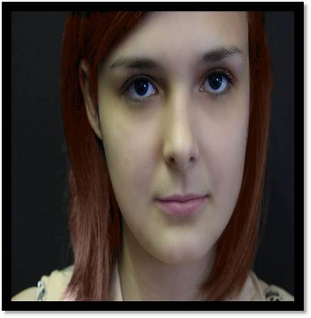
|
Photoshop tools used to create the lips and hair
We began with the skin, we used the clone tool in order to remove all the freckles and dark shadows under the eyes.We then moved on to use an light brown paintbrush to colour in the hair to change the shade of the hair. We then moved on to the lips by again using a paint brush in an light pink shade to make vicky appear to look like she is wearing lipstick. Light blue paintbrush is used to outline the pupils to make vicky have blue eyes. We then finally used a thin paintbrush to outline the eyes to make them stand out more. L.R
Before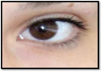
|
After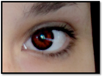
We used an red paintbrush to fill the eye to change the colour to red then we used an thick black outline to highlight the eye L.R
|
Before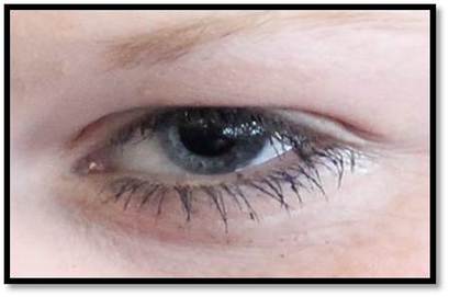
|
After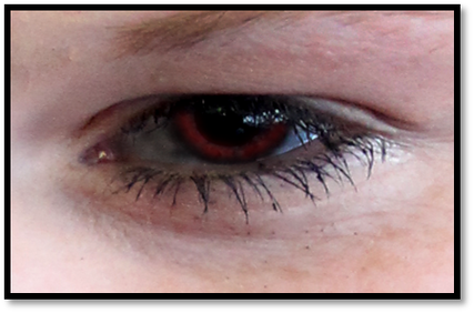
Again we used a red paintbrush to change the colouring of the eye from light blue to an light red shade then we used thin paintbrush to highlight the eyes L.R
|
Before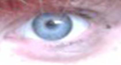
|
After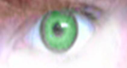
We changed the colour from an light blue shade to an bright green shade to make the eye stand out to the viewer as well as again outline the eye with an thin black brush. L.R
|
Photoshop tools
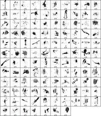
Blood brushes
|
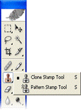
Clone stamp tool L.R
|
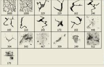
Crack brushes
|
Colour change L.R
|
Burn tool
|
Paintbrush tool L.R
|
Step by step pictures
1. orginal shot
|
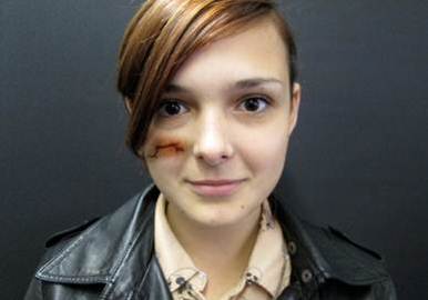
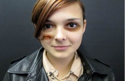
2.The burn tool used to colour underneath the cut, Then the cut shaped paint tool used to make cut L.R
|
3. Burn tool used around the eye to look like an black eye
|
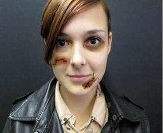
4. Burn tool used underneath with different shaped paint brush on top to apply cut on face L.R
|
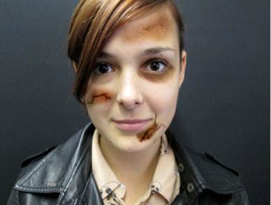
5. Burn tool used again on head, with faint cut on top made by a different shape to look like crack on the head
|
6. Final shot , eyes coloured with white paint tool to make them look paranormal L.R
|
Magazine trial
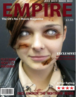
On this poster the tagline 'Once awoken, the nightmare begins' is catchy therefore people will remember it easier. This would also allow the audience to relate it to the film. The cuts on vicky's face would relate to what has happened to her in the film. From vicky's wearing black clothing would show evilness. vicky's eyes on the magazine are glowing white this would tell the audience from the magazine cover that vicky is paranormal in the film. The glowing white eyes would also help vicky to stand out. From the magazine we can also see that vicky is in character. This would show by her being shown as paranormal as well as having cuts on her face.
L.R
L.R
Trial Poster
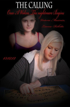
To create this poster we darkened the background in order to give the audience a sense of mystery within the film as well as by doing this would make the characters stand out. we then lightened the skin of the character stood behind to show they are ghost like. The writing on the poster is displayed in an red coloured font to represent the blood within the film. The girl on the poster is seen to be playing with the ouija board this would be shown on the poster to tell the audience the ouija board is a main part within the trailer.
Overall, within the poster there is key things that would tell the audience what is going to happen within the film and to tell the audience what the film is about. As we can see the ouija board is an main part of what the film is about. The ghost is shown in the poster behind the girl which would make the audience believe she is unaware of the existence of the ghost. L.R
Overall, within the poster there is key things that would tell the audience what is going to happen within the film and to tell the audience what the film is about. As we can see the ouija board is an main part of what the film is about. The ghost is shown in the poster behind the girl which would make the audience believe she is unaware of the existence of the ghost. L.R
final magazine front cover
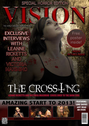
In order to create this poster we first began by finding a dirty worn looking wall for the background as we thought this would represent what the cellar was like in our trailer. We then took a picture of Victoria in a pose so it looks like she is looking up to the spirits in order to do this we took inspiration from 'The Unleashed'. Next we went on to use an 'Blood tool' by applying the red brush also made the effect on blood splattered on Victoria and in the background.
We continued on to begin to design the title using the Bevel and Emboss tool by going in to Layer>Layer Style>Bevel and Emboss. From this we alternuted the setting in order to create an thick red bold looking text. To create the 'Free poster sign' We firstly used the circle tool, by doing this we used the fill tool in order to make the circle red.We continued on to use the text tool to get the 'Free poster inside!' to make the font white bold we used the 'Bevel and Emboss'.
To create the 'Unseen pictures inside!' we firstly choose the red text tool, then continued on to use the 'Bevel and Emboss' to create the text bold with the shadow on the background. 'The crossing' we made it by choosing a font to creat the title we then continued on to use the Bevel and Emboss tool to make the title look bold and stand out. To make the new 'T' we made a wide gap in between the 'S' and the 'N'. We then used the same font into making the t by getting two 'T's on top of eachother however rotating one round in 180 degrees and then getting the Next i went 'Eraser Tool' to get rid of any extra bits to make it look like a cross. In order to put holes in the cross to make it like the other text we again used the 'Eraser Tool' however this time in a smaller size to make the holes in order for it to fit it with the others.
